Start with these reference images:


 Start at the top of the page with a combination of the following colors: Cerulean Blue, Cobalt Blue, Winsor Yellow and Burnt Sienna, just putting the colors down and letting them mix on the paper. As you come upon the flowers start using the local hues to shape in the flower. Use Burnt Sienna for the middle of the flowers. Alizarin Crimson and Cobalt Blue are used in the vase. Afer the shine is gone on the paper, use a credit card (the side of the card) to scratch out some petals and stem and foliage areas. Let dry.
 Going in now with the middle values, using Gambage to develop some of the petals, Winsor Yellow and Winsor Red are also used. Ultramarine Blue and Burnt Sienna are used in the middle of the flowers. Darken the side of the vase with the same colors used above. Develop some foliage areas around the flowers. Let dry.
 Our final wash will consist of values that are the darkest on the value scale. Using Burnt Sienna, Winsor Green and Alizarin Crimson, indicate some texture on the centers of the sunflowers. Using the same dark indicate some dark shapes around the sunflowers, using the value sparingly, painting negatively around some of the petals. I put clean water on the vase and overlaid the same colors but tried to smooth out the values. The colors around the sunflowers consist of Alizarin Crimson and Gamboge.


 Start at the top of the page with a combination of Cerulean Blue and Cobalt Blue for the sky area. Using the same blues add Winsor Yellow and make some tree shapes, sculpt out around the buildings, leaving the white of the paper. As you go down the page introduce Winsor Yellow and Winsor Red to make an array of oranges, adding Alizarin Crimson at the bottom. The water consists of Cerulean Blue and Cobalt Blue, using more pigment at the bottom of the page. Let dry.
 Now using your middle values repeat the same steps as above, but use more pigments and less water to get a darker value. You are going to start giving the colors shapes, with negative painting (painting behinds the shapes). Indicate the dock area with Burnt Sienna and Ultramarine Blue. Use the side of a credit card to scratch out the posts and tires on the dock. Using Cobalt Blue and Ultramarine Blue indicate some line work in the water with smaller shapes further back and larger shapes as you come forward. Let dry.
 Now using our darker values go in and define a couple of shapes in the foliage area. Using Burnt Sienna and Ultramarine Blue paint the roofs on the buildings, adding windows. Cobalt Blue is used on the boat house, painting around the white shapes. Then add Burnt Sienna and Ultramarine Blue for the window areas. I soften the edges of the water by using a large flat brush with clean water and going over the entire area a couple of times.


 Using some masking fluid indicate your birch trees. Indicate the local colors starting with the background foliage area, changing the colors as you go. Below the halfway mark on your paper start to show the river with blue hues. Let dry.
 Go in now with middle values and start to build up the foliage shapes, keeping the yellow clean in top of the river. Show rocks by dropping burnt sienna and ultramarine blue in that area and then taking a credit card and scratching the surface. Show an island in the middle of the river with some foliage colors. Drop in some red hues to show more contrast in your colors. Using a credit card scratch out some birch trees. Let dry.
 Now using our darkest values show a shadow side on the foliage, usually under the branches. Negatively paint around some of the rocks. Add a darker value blue hue on one side of the river and soften the edges. Scratch in some grasses in the middle island. I added some Gouache to my birch trees to stand out some more, or in the first step you can also use a masking fluid to save the whites. Let dry.


 Starting at the background indicate a sky color and then start showing the foliage areas, changing the color as you go. Indicate the shape of the path by leaving the white of the paper. As you proceed show the foreground foliage. Also drop in a light shadow color on the path - by mixing the three primaries you will get a nice gray. Let dry.
 Now using the same color palette as above we will proceed using our middle values on the value scale. Start to show some forms in the foliage and shapes, keeping the value darker than what you already have on the paper, trying not to cover up all of our first wash. Keep the edges of the path soft. Let dry.
 Now use our dark values to show foreground trees, letting the previous colors show through. Show a darker value shadow on the path. The shadows from the trees should be connected to the shadows on the ground.
| Start with these reference images:
|
|
|
|


 Starting at the top with a graded wash, continue down the page with the sky color into foliage shapes and colors. Continue the same wash into snow and indicate the path.
Let dry. When the first wash is almost dry, go back into the foliage area and apply another layer of paint. This will cause some interesting shapes called rumbacks. Change the color also to make it interesting.
 When this is dry, indicate trees, varying the color, size and shape. Once you have the trees in place, show shadow shapes from the base of the trees, with a blue and burnt sienna color. The shadows will follow the contour of the ground.
When this wash is dry, start to shade the trees, keeping in mind where your light source is coming from. Add branches onto the trees and some dead foliage in the snow.
 The last step is analyzing the values. The value is darker on the path than the snow.
| Start with these reference images: | |
 | |
 | |
| This will be a wet into wet technique. Wet the entire paper with clean water. Starting at the top of the page use blue hues and then go into yellow. Do not mix a lot or your colors will turn green. Add red and yellow to make an orange; add a little ultramarine blue, alizeran crimson and cobalt blue to the bottom of the page. Using a paper towel, dap out the sun area. Let dry. |  |
| We are going to repeat the first process again but using more pigments, and this time your paper is dry. Go back in with a thirsty brush and pick up some colors for the reflection of the sun. Again dap out the area on the sun while the pigment is still wet. Let dry. |  |
 I wanted a little more yellow in the sky area, so I again went in and glazed over the previous wash. Let dry. Show the horizon line with a darker value, softening the edge on the bottom. Paint the trees and rocks in the foreground area, making the colors warmer near the light source (the sun). Show some motion in the water by adding darker values and keeping the edges soft. Show the tree branches on top by keeping the colors warmer near the sun and cooler as they recede. Add some foliage. Let dry. I wanted a little more yellow in the sky area, so I again went in and glazed over the previous wash. Let dry. Show the horizon line with a darker value, softening the edge on the bottom. Paint the trees and rocks in the foreground area, making the colors warmer near the light source (the sun). Show some motion in the water by adding darker values and keeping the edges soft. Show the tree branches on top by keeping the colors warmer near the sun and cooler as they recede. Add some foliage. Let dry. | |


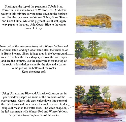
 Starting with the background and at the top of the page, use blue hues for the sky, and continue down the page into the foliage areas, using a variety of greens and yellow ochre. Start to sculpt out the shape of the waterfall, negatively. Add rock colors and while the pigments are still wet apply a piece of wax paper on top. Using a credit card scratch out some birch tree trunks in the background. Soften the edges of the rocks with clean water. Let dry.
 We are not going to start the second wash with our middle values on the value scale. Start defining tree shapes, using your value study with positive and negative shapes. Leave the lights in some areas from your first wash. Put in the background evergreen trees with a lighter value to show the tree is further back in the woods. Indicate the water area. Let dry.
 Our final wash will be using our dark values, putting the shadows on the trees on the bottom of the branches. Start to define the shapes in the rock forms, softening the edges as you go. Start to build up the values in the water, keeping the values on the lighter side of the value scale, with soft edges. When the waterfall hits the flat water, carry the white shapes horizontally to show it's a flat surface. Let dry.


 Wet paper with clean water, load brush with Winsor Yellow and indicate yellow tulips. Continue to add Winsor Red with the yellow to make orange and indicate the orange tulips. Clean brush and make red tulips with Winsor Red, alizarin crimson and cobalt blue will make your purple tulips. Cerulean blue and Winsor Yellow will be used to show the foliage areas around the tulips and for stem area. The background color is mixed with Winsor Yellow, Winsor Red and cobalt blue in equal amounts. With more water the value will get lighter. Let dry.
 Using our middle values we will now start to define the tulip shapes, showing a shadow and light side. Indicate the stems in the vase with gamboge and cobalt blue, letting the first value show through in areas. Continue to use this green to add leaves between the tulips. Let dry.
 Our last wash will consist of darker values - Winsor Green and alizarin crimson will be used to make our darkest value. See the value reference to see where those shapes should go on the stems and on the foliage. The vase is made by painting around the vase with a darker value, leaving space for the sides of the vase, to indicate a glass vase.
