Start with these reference images:


 Starting at the top of the page using blue hues, continue down the page introducing greens in the foliage areas. Watching your value study to see where your lightest lights are, make the horizon line a light yellow. Indicate the pond with a cerulean blue and the foreground area with yellow ochre and burnt sienna. Show your flower shapes with a light pink hue. Add green in the foreground at the bottom of the page. Let dry.
 Using mid-tone values, start to show tree shapes using your value study. At the back of the pond indicate a darker color and soften the edge as you come forward. The edge in front of the pond should be rough to indicate the foliage is in front of the pond. Drop in burnt sienna to show a value change in the foreground area. Using these same values negatively paint out the shapes of the flowers. While this pigment is still wet, use a credit card to scrape out some grasses. Paint negatively the grasses on the bottom of the page.
 Using dark values - alizarin crimson and thalo green are a nice combination - put in your dark shapes. Change the color by using a little burnt sienna with ultramarine blue. Build up the flowers by showing a value change, from your light side to mid-tone to a shadow side with a darker value. Using a dark green hue show leaves on the stems. Indicate some grasses with a rigger brush.


 Start at the top of the page and work your way down from one color to another, working background to foreground, light values to dark values. Start to indicate the local hues of the different areas of the painting, watching your value study to keep your light shapes. Let dry.
 Our second wash will consist of mid-tone values. Start to paint positively (the tree) and negatively. See our center of interest in the lower right corner, that tree was painted negatively. Show shadows on the road with a light color, keeping your strokes horizontally as to keep the road smooth. Show brush on the sides of the road with some vertical strokes, making sure your shapes are interesting and different. Let dry.
 As we work our way down the value scale we are now going in with our darkest darks (look at your value study to see where these shapes are). Make your dark shapes interesting and different from each other. On the evergreen trees, your darks will be placed on the underside of the branches. Indicate some tree trunks also with the darks. Where your lightest light and darkest dark meet, this will be where you are telling the viewer that you want them to focus on that area (center of interest). Go over your shadows once again on the road with a cool color. Using a rigger brush, indicate some dead branches and some grasses along the road.

 With blue hues paint the sky, adding water and no pigment as you go down the page. Start to indicate foliage as you sculpt out the barn shape. This painting will be a predominately warm painting with a touch of cool. Continue on down the page with local from you reference sheet. Let dry.
 Start your second wash with mid-tone values. Start to make tree shapes in the background with darker values. Using the edge of a credit card, scrape out some tree trunk shapes and grasses in the foreground. Repeat with the same colors - just darker values - in the foreground. Indicate windows and doors in the barn with darker values. Refer to your value study to see the dark shapes. Let dry.
 Your final wash will consist of darker values. The roof, doorway and foreground are going to be your darkest values. Make sure your vertical lines of the building are parallel with the edge of your painting. Indicate some foliage in front of the doorway on the barn, by wetting the pigment and dragging the edge of the credit card through the area. Add some dark limbs and tree trunks.
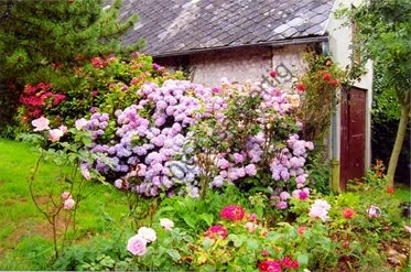

 >Using the value study as a guide, leave your white shapes your lightest values. Carve out around these shapes with the different local hues from the photograph. This is done in one continuous wash. Let dry.
 Drop in the local hue on the flowers. Start to build up your shapes with middle values hues, leaving your first wash to show through in some areas. Use a piece of a credit card to scratch out some grasses. While the pigment is still wet on the roses, use a credit card to show some line work and shape on the roses.
 Now start to show your dark shapes from your value study. To build up the flowers, add another darker value to show a shadow side. Divide up the shape into smaller shapes with value and dark shapes. When the roof is dry, show line work which will give the roof some texture. Also show some line work in the flower stems and grasses.

 Using a light value and a blue hue, start at the top of the page and work down, adding colors for interest where the shapes in the reference images dictate. When you come to the rock areas, add lots of color, and while the color is still wet, add a piece of wax paper on top. Let dry. The reflections for this painting are going to be mainly green, because it will be reflecting what is above it.
 Using mid-range values, start to define the tree shapes in the background. Don't cover up all of the previous washes - let some of them come through. Pick out some rock shapes where you like the texture on them. Define them by putting a dark value behind the shape and softening the edge. Drop in some of the rock colors in the reflections with a vertical stroke, then with a large, flat brush that is damp, drag the brush horizontally. Use the tip of the brush like a thirsting brush, dragging some horizontal lines to show movement in the water.
 The final step in the painting will be using our darkest darks. Refer to your value study to see these shapes. Where your center of interest is your darkest and lightest light should meet. Use your darkest dark as an accessory in the painting, adding it sparingly.

 Start at the top of the page as we paint background to foreground with a sky color and proceed into the foliage areas on each side, keeping the values light. Continue on down the page putting in the local color, leaving the water the lightest value. Cut out the shape of the bridge. Let dry.
 Using the middle values, we now start to indicate more shapes, in foliage and rocks. Is your negative shape, the sky, an interesting shape? Putting down rock pigments, put a piece of wax paper over the wet pigment. Let dry. This creates wonderful texture. Bring out some rock shapes by putting a dark value behind some of the rocks, softening the edge as you go.
 The final step will be going in with some dark values to bring out some of the dark shapes (refer to the value study). Scrape out some texture with a credit card while the paint is still wet. Stand back from the painting and see if your values are correct and your shapes are interesting, negative and positive.

 Before you begin to paint, study the value study on this lesson and notice the white shapes. Begin painting with a sky color, adding water as you go down the page to make the value lighter. At the horizon line, start to sculpt out the white shapes with a similar color and value as the sky. Snow follows the contour of the surface that it's on.
 When the first wash is dry, start to indicate the foliage area in the background, using greens to indicate evergreens and burnt sienna to show some dead foliage on the trees. Remember to leave sky holes.
 Continue to work down the value scale introducing darker values to show form. Indicate tree trunks with darker values and scraping with a credit card on the lighter side of the trunks. Remember where your light source is coming from. Your cast shadows will follow the contour of the landscape.
 Using your darkest values, overlay areas on the tree trunks and some foliage areas. Make twigs and branches in the snow and on some of the trees. Show some dead leaves on the path. Soften the bottom edge of your trees to make it look like it is sitting in snow. Stand back from your painting and evaluate color, values, composition, and edges.


 Starting at the top of the page using blue hues, create a graduated wash, by adding water as you go down the page. This will make the value lighter, continue down the page by introducing yellow ochre and then blue hues again for the water. The foreground color is yellow ochre. After this is completed go in with a thirsty brush (a brush with no color and very little water on it) and lift out the shapes of the birch trees. Let dry.
 Start the second wash with mid-values with green hues, pay attention to your value study and the shapes. Indicate trunks on the trees and continue with the same color and value into a shadow on the foreground. In this reference the light is coming from the right. Make interesting shapes for the branches. Let dry.
 The last wash consists of values 1 through 4 on the value scale. Use your reference-value study as your guide as to where your putting the dark shapes. Do not cover up all of your previous washes, only on the underneath side of the branches. With a mixture of hues indicate grasses behind the trees. Drop in some color for rocks and using a credit card scrape out on the light side of the shapes.

 Start with the background and work to the foreground. Work light values to dark values. The first wash will consist of all light values, starting with the sky and working your way down the page with local hues. After putting pigments on the page for the rock forms, take a credit card and scrape out the highlight side of the rock. Let this wash dry.
 Start defining the foliage shapes using your value study, putting in the mid range values. Indicate some tree trunks and branches. Do some negative painting on the rocks, (painting behind the shape). Show a reflection in the water from the rocks. A reflection is a mirrored image of what is above it. Let this wash dry.
 Using our darker values, start to accent your dark areas, as indicated on your value study. Darken the reflection shapes and while this is still wet use a piece of a credit card to indicate some horizontal lines in the water on the reflections. Ask yourself if you have a wide range of values, does your composition work? Stand back from your work and make adjustments as needed.


