


 For our first wash we will keep our values light. Start at the top of the page with Cerulean Blue and add water as you come down to the horizon line. Add some Aureolin to the blue and indicate trees. For the rocks use Burnt Sienna, Yellow Ochre, and Cobalt Blue. Put the color down and don't mix it. While the pigment is still wet, apply wax paper for the top. Let dry and remove. For the water use Cerulean Blue and water where the value is lighter and add cobalt blue to the button area. Let dry.
 Our second wash we will focus on our middle values, adding more pigment and less water. Using Cobalt Blue and Gamboge indicate evergreen trees along the horizon line. Using Ultramarine Blue and Burnt Sienna start to define the rock shapes, trying to take advantage of the texture where you have it. For the reflections use the same colors that are above the water for the rocks and trees. Bring these colors down in a vertical manner and then with a flat brush, no color and just moist go across the area horizontally. Use the tip of the brush to show some movement in the water.
 For our last wash we will be using our dark values. Winsor Green and Alizerin Crimson will make a beautiful dark value. Looking at your value study, indicate darks where shown for the trees. For the rocks add a little Burnt Sienna to the same mixture and add darks to the rocks (same thing for the water also).
Start with these reference images:


 Using the reference as a guide, make a couple of reference marks as to where some of the shapes are. Starting at the top of the page, use Cerulean Blue and a touch of Cobalt Blue for the sky color, outline the shapes of the buildings and drop in some Winsor Yellow to indicate the tree areas. While the pigment is still wet, pick up some pigment with a Kleenex to indicate some cloud shapes. To indicate the building areas use Burnt Sienna, and paint the umbrellas with pure pigment, leaving white shapes for people. The water colors are Cerulean Blue and a touch of Gamboge. Let dry.
 We are now focusing on our values in the middle range. Start building the palm tree with Cobalt Blue and Gamboge. Continue to build the foliage areas negatively painting the umbrellas. Show a shadow on the umbrellas. Use Cobalt Blue and Gamboge for the water area. The roof colors are Burnt Sienna with a touch of Ultramarine Blue. Let dry.
 On our third wash we will be using our darker values on the value scale. Starting on the palm tree, show where your dark shapes are from your value study. Bring down that dark value onto the tree trunk. For the mass of the building use Burnt Sienna and Ultramarine Blue. When the shine is gone scratch into it with a credit card to bring out some shapes. Negatively paint the umbrellas and the white shapes of people in the foreground. Add some Ultramarine Blue and Gamboge on the tree to indicate some dark shapes. The water is Cobalt Blue and Gamboge. When almost dry use a credit card to scratch some movement into the water.
Start with these reference images:


 Using a wet into wet technique, apply clean water over entire page. Starting with our lightest of values, apply Cerulean Blue and Winsor Yellow on the background area. Start to drop in the local colors of the pears. The shadow color is Cerulean Blue, foreground color is a very light background color. Lift out highlights on pears with thirsty brush. Clean up any edges on the pears on the table side also. Let dry.
 Our values will now be more middle values, more pigments, less water. Indicate the background with Cobalt Blue and Winsor Yellow. Add a little Burnt Sienna as you go across the page, more Burnt Sienna and Cobalt Blue on the right side of the page. Try not mixing the colors. Continue to show the local hues on the pears, lifting out the highlight. Light source on the right side of the fruit. Let dry.
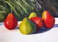 Starting at the top of the page using darker values, same pigments, repeat the same wash. While the pigment is still wet, use a credit card and scratch out some foliage shapes. Add some salt for texture. Scratch out the stems also. Use sharp edges when defining the fruits. Let dry. Go back into the fruit with your darker values and shadows. On the table top show a cast shadow with cobalt blue with a little Burnt Sienna.
Start with these reference images:


 Wet the entire paper with clean water, starting in the middle of the paper using Aureolin pigment with horizontal strokes. As you go up the page introduce Winsor Red. Below the horizon line or middle of the paper use Windor Red going down to the bottom of the paper. Using a thirsty brush pick up some color in the sky area. Let dry.
 Using clean water brush the Aureolin area only, then apply Winsor Red, Winsor Yellow, Gamboge and Alizarin Crimson. Repeat these same colors in the foreground areas with the addition of Ultramarine Blue. Look at your value study to see where these values go. Let dry.
 The last wash will consist again of the same colors, more pigment less water and trying to get as close to the values on the value study as possible. Put in far horizon line with Alizarin Crimson, Gamboge, Ultramarine Blue. For the rock shapes we will use Alizarin Crimson and Ultramarine Blue with a little Winsor Green. Carry this color out into the composition where the value study is very dark and soften the edges. Use a thirsty brush in the foreground area.


